
Buddhabrot
You’ve heard of the Mandelbrot set, right? Basically, for each point \(c\) on the complex plane, we iterate the function \(z = z^2+c\) and color the point \(c\) based on how many steps it takes until \(\lvert z\rvert\geq 2\) (which is known as “diverging” or “escaping”).
I recently learned of another visualization called the “Buddhabrot,” originally discovered by Melinda Green. In the Buddhabrot, you color each complex point \(t\) based on the number of times that \(t\) is visited by the escaping trajectories of all points \(c\). As Wikipedia says, this produces a graph of “the probability distribution over the trajectories of points that escape.”
Note that the point \(c=(-\frac{1}{4},\frac{1}{8})\) does not escape, so it would be colored black in the typical “Mandelbrot set” visualization. But \(c=(-\frac{3}{4},-\frac{1}{4})\) does escape, and its trajectory visits \(t=(-\frac{1}{4},\frac{1}{8})\); so \(t=(-\frac{1}{4},\frac{1}{8})\) does contribute some color to the Buddhabrot.
Besides the pretty pictures on the Wikipedia page, there are also some neat grayscale images generated by Martin Ender’s code-golfed version on Stack Exchange.
Notice that, generally speaking, when the computer generates a Mandelbrot or Buddhabrot, it’s never really sure that a certain point’s trajectory never escapes. All it can do is iterate the function \(z = z^2+c\) for a certain number of iterations \(T\), and if it hasn’t escaped by then, we give up and mark it as “doesn’t escape.” So when we’re generating these renderings, the number of iterations \(T\) turns out to be a significant parameter.
The Mandelbrot set is fundamentally “black and white”: either a point \(c\) is in the set, or it’s not. The Buddhabrot is fundamentally “grayscale”: each point \(c\) can be colored with the number of times it appears on escaping trajectories.
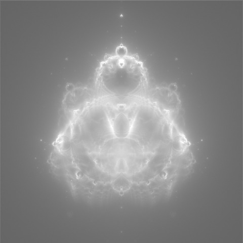
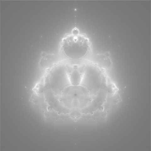
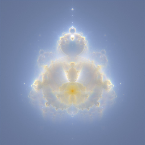
It’s traditional to apply “false color” to the space around the Mandelbrot set: For each point \(c\) whose trajectory does escape, we can color \(c\) with the number of iterations it takes to escape. (And then we can map those integers to a nice rainbow gradient.) Melinda Green also invented a way of false-coloring the Buddhabrot: We can render a grayscale version with \(T=500\), another grayscale version with \(T=5000\), and a third with \(T=50\,000\). Then we use these three grayscale images as the red, green, and blue channels (respectively) of a full-color image. Points (such as \(t=(0,0)\)) that lie on more quickly escaping trajectories than slowly escaping ones will tend toward red. Points that lie on more slowly escaping trajectories than quickly escaping ones will tend toward blue.
 |
 |
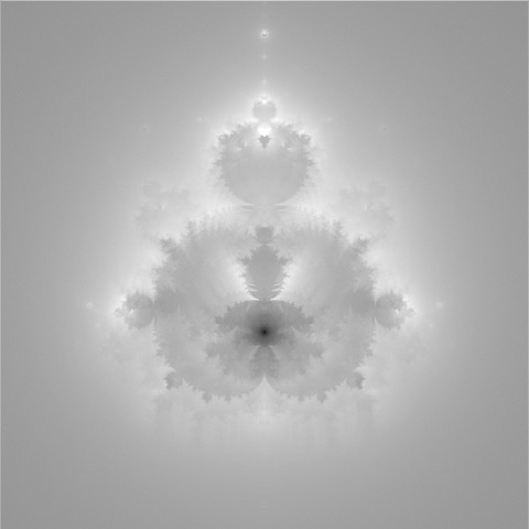 |
| Red | Green | Blue |
 |
||
| Combined |
The coordinates for generating the above image are
constexpr TargetProperties target = { -0.4, 0, 0.32 };
constexpr BitmapProperties bitmap = { 480, 480 };
You can postprocess the color output with this
convert
command line to produce an image very similar to
Wikipedia’s “Nebulabrot”:
.png)
convert color.ppm -normalize -level '0,90%' -gamma 0.8 nebulabrot.jpg
 |
Zooming into the Buddhabrot image is harder than zooming into a plain Mandelbrot image, because in the Buddhabrot, the colors of points in the “view window” can be affected by the trajectories of points far outside the window. At first it seems like the only way to render a small piece of the Buddhabrot is to render the whole thing and then crop it. But Alex Boswell points out that each time you find some point \(c\) that contributes to the image in your selected view window, you can apply the Metropolis–Hastings algorithm to sample some nearby points and estimate their contributions too. This lets you quickly sketch in whole splotches of the view window. (Mind you, I don’t understand this math very well.)
Fortunately, Alex Boswell wrote some C++ code (here) implementing his ideas (using C++03, and SDL for the graphics); I spent a day extracting the core of it into a C++14 program (saving image files to disk for the graphics), which you can find on GitHub here.
After I’d spent a day on this, naturally it turned out that other people had already done it better. Follow the links from Wikipedia far enough and you find Daniel Lawrence Lu’s dllu/puppybrot and Benedikt Bitterli’s mathematical explanations and 4K video (perhaps especially of interest if you’re looking for ways to de-noise the image).
Anyway, you can use my-version-of-Alex-Boswell’s-code to produce NASA-ish images such as the following. This is a zoom in on the largest bulb on the right side of the Buddhabrot’s “breastplate.” The blue-shifted colors are a result of the Metropolis–Hastings algorithm’s splotchy sampling; see my repo’s README for more details and comparisons.
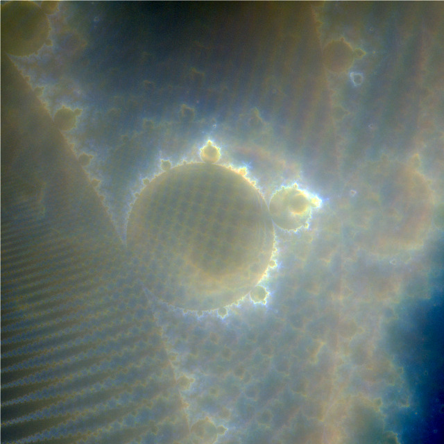 |
The coordinates for this image are
constexpr TargetProperties target = { -0.42, 0.11, 9.0 };
constexpr BitmapProperties bitmap = { 640, 640 };
and I postprocessed it with this
convert
command line:
convert color.ppm -normalize -gamma 1.5 -normalize bulb.jpg